IFIC renews its corporate image on its 75th anniversary
The Institute of Corpuscular Physics (IFIC), a joint centre of the CSIC and the University of Valencia, launches a new corporate image to mark its 75th anniversary and the award of its second Severo Ochoa Centre of Excellence distinction. The Severo Ochoa accreditation recognises “the quality and level of excellence” of the centre's research. This is the second time IFIC receives this distinction, after previously obtaining it for the 2015–2019 period. These milestones highlight the scientific relevance of the institute and explain the chosen timing to update its brand: the visual renewal aims to reflect a modern, dynamic IFIC that is connected to society, in line with the innovative nature of its research work.
New corporate identity
A corporate image encompasses how an institution is visually perceived, including the set of beliefs and associations (ideas, values, attributes) that the public receives visually. With this new visual identity, IFIC aims to reinforce these values: the centre’s logo, colour palette and typography have been redesigned to achieve a contemporary, cohesive and recognisable style. A brand manual has also been produced to guide the correct use of the new logo and graphic elements across all institutional platforms (website, outreach materials, presentations, etc.), ensuring consistency in every public appearance. To mark the anniversary, an additional special version has been included alongside the main version to highlight the 75 years of history.
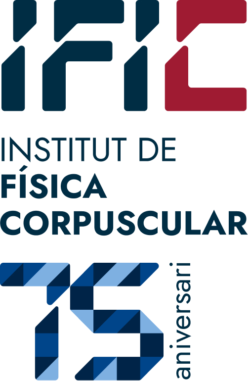
Geometric logo: The new logo incorporates lines and basic geometric shapes as a metaphor for scientific progress from simple elements. According to the designers, the logo is based on figures of increasing complexity to evoke the development of knowledge—from very complex shapes down to the point, as the most fundamental unit in scientific understanding. Within this metaphor, we are currently at the “triangle” stage. From there, a grid is created to structure the logo’s design.
Symbol of connection: In the current logo, the acronym “IFIC” is split into two parts, a visual resource that symbolises the connection between science and society. This duality reinforces the mission of the institute: excellent research with a public projection. Furthermore, the distinctive shape of the “I” is meant to represent various aspects of nuclear and high-energy physics, such as the collision between two particle beams, a collimator in an accelerator, two matter jets in astroparticles, or even the spontaneous symmetry breaking of the Standard Model, through which particles acquire mass—and the logo its character.
Dynamic colour palette: Vibrant, contrasting colours have been selected to convey dynamism and innovation. The chosen tones bring energy to the logo and distinguish it from the previous version, giving it a friendlier look and aligning it with the visual identity of its parent institutions, the CSIC and the University of Valencia.
Corporate identity manual: A brand manual has been published to establish guidelines for using the new identity. It includes logo variants (horizontal, vertical, monochrome), colour rules, institutional fonts and examples of applications in stationery and digital media. This guide ensures that all IFIC research groups, departments and events apply the new image consistently.
Corporate video: The centre is also working on a modern version of its corporate video showcasing all its activities, which will be available soon.
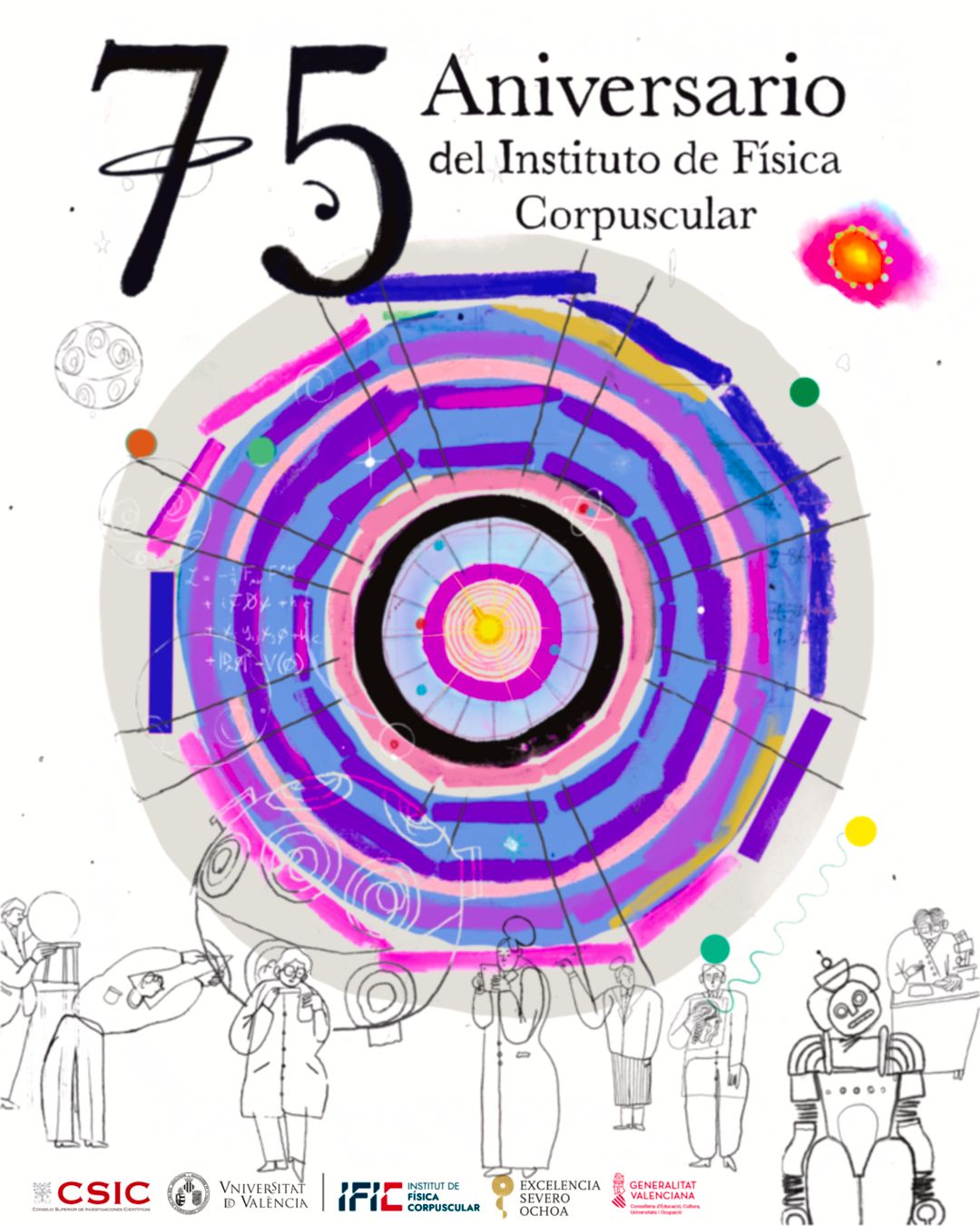
75th Anniversary Poster
As part of the anniversary celebration, visual artist Víctor Visa has created a commemorative poster that encapsulates the scientific spirit of IFIC. The central motif is a primordial explosion from which particles and stars emerge, alluding to the expansion of the universe. Superimposed on this background is a colourful reinterpretation of the ATLAS detector diagram from the LHC, in which IFIC participates, composed of concentric circles. As the artist explains, this image symbolises “working on the smallest to reach the greatest”: the nested circles suggest that by studying elementary particles—the tiniest building blocks—we expand our understanding of the entire cosmos.
The design also includes other details meant to represent the full scope of the institute's work. At the centre is a visualisation of a kind of primordial explosion from which particles, stars, and other elements emerge, evoking the universe's expansion. General physics elements can also be identified, such as the representation of the absolute neutrino mass from supernova explosions.
At the bottom of the image are minimalist human figures. These silhouette outlines provide scale to highlight the detector’s immense size and offer a historical perspective. Each figure carries elements from different eras—clothing or objects—portraying the passage of time across the institute’s 75 years and paying tribute to the generations of IFIC scientists and the evolution of research in Valencia. Overall, the new corporate image and anniversary poster position IFIC as a forward-looking centre, with a renewed brand that conveys its scientific values to society. The institution trusts that this fresh and symbolic visual identity will clearly communicate its commitment to research excellence and public engagement.